Six Essentials For Great Website Design
Great web design is important for any website business. The right design will help you to create a website that works, whether you build it yourself or or hire web design and development in Vancouver to create the perfect site.
There are lots of methods to build websites and lots of popular systems to build in. If you’re going to complete the build yourself some training in using WordPress, some basics of graphic design or Kentico training may be useful.
- Color. It can be tempting to throw a lot of color at your website to make it stand out, but this is the wrong approach. Instead, choose a limited color palette, so the colors you do use can pop better without making the site look too busy. Too many colors are confusing for the eye. Instead, stick to just a few colors from your brand color palette. Choose shades that suit your business and use them throughout the whole design.
- Typography. The typography you use should be clear and easy to read. For a more serious business, choose a plainer font. For a quirkier business, you can choose something more unusual, as long as it is still easily readable. Avoid uneven margins, and short lines left trailing at the end of a paragraph to avoid messy looking text. Don’t stretch text, as this makes it harder to read. Space the text out to provide some white space for the eye to rest as they read, but avoid spreading the text out too much too. Keep line lengths reasonably long, as this is more comfortable to read, saving the eye from flicking back and forth.
- Illustration. The images you use should fit well within the design. Think about their colors work with the rest of the design to avoid clashing. Keep different elements on the page in scale with each other, to push the eye where you want it to go. The largest element will draw the eye first so think carefully about the size of your images. Make sure any images are high quality so they don’t unclear on larger screens.
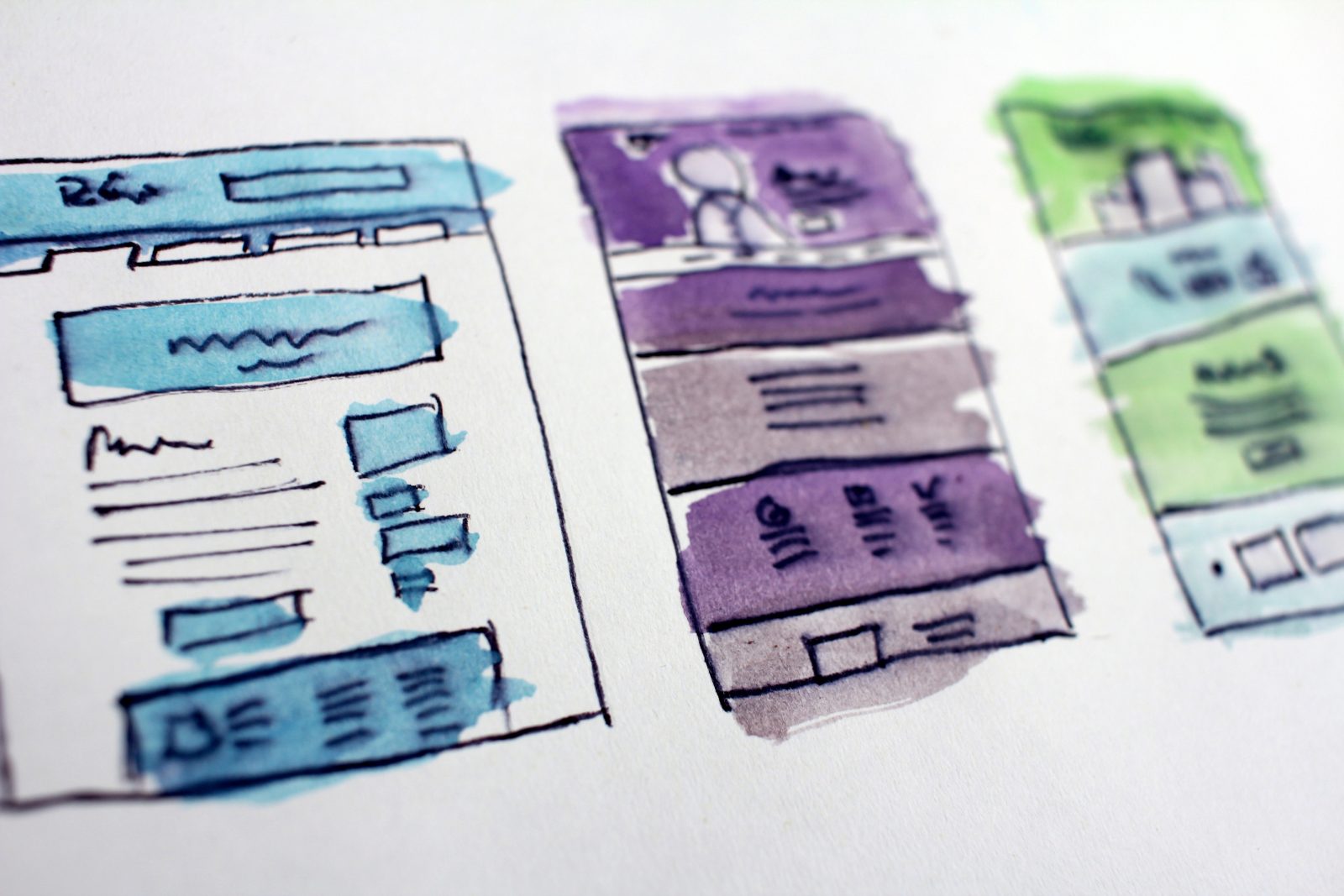
- Layout. Manipulating the font, color and scale means you can drive attention to the most important parts of your design, and direct the user around the page in the way you want. Choose a clear alignment. A grid alignment works best, as different elements are distinct from each other. Align them well so different elements complement each other. Don’t be tempted to cram every space with something. White space keeps a design uncluttered, making everything easier to read and interact with.
- Simplicity. The best design should be able to convey its message in a short amount of time in a way that is pleasing to the eye. A simple design allows the viewer to absorb information without becoming distracted. Keep special effects to a minimum, and display data in a simple format.
- Contrast. A clear web design needs to be readable. Don’t compromise readability for the aesthetics of a design. The colors and text that you choose should be selected only after thinking about how they will contrast with other nearby colors. Low contrast between text and the background can look nice, but this makes it harder to read. If the reader can’t identify the text at first glance, then the design doesn’t work.
Besides all of the above-mentioned points, you know time is money and sometimes it is better to not spend so much time exploring the things that you have no idea about. In this case, if you feel you can do something much more important and valuable for your business, it would be better to collaborate with a web design agency and let the professionals do their job via creating a great website for you or your business.

