

Benji Lewis design advice cuts against a long list of popular trends, and the UK-based designer, who has spent over 27 years working in luxury interiors, is unusually specific about what he avoids in his own space.
Lewis operates under the studio Benji Lewis Design, taking commissions for both UK and French projects, and separately runs Zoom That Room, a virtual consultation service offering one-hour sessions to clients anywhere in the world. He also owns a home in the Landes region of France, giving him a dual perspective on what works across different living environments.
His list of things he would not install in his own home covers flooring, lighting, seating, wall treatments, and a few decorative habits that have lingered well past their moment.
Where Benji Lewis Design Advice Begins: Lighting and Atmosphere
Lewis is particularly firm on recessed ceiling lights, which he says are overused in the United States. ‘You end up in a room that’s lit like Terminal 5 at Heathrow Airport,’ he said. The lighting is ‘useful for finding your pants and socks, but apart from that, it’s just horrible.’
His preference is zoned lighting: a spotlight on a piece of art, a wash across a corner, or a neat floor light positioned beside an armchair. ‘I’d do a nice, neat little floor light positioned beside an armchair that does a smart, chic little wash of light onto the armchair,’ he said. If overhead lighting is unavoidable, he installs dimmer switches. ‘Use your light to create atmosphere,’ he added, suggesting homeowners consider hiring a lighting planner if the task feels overwhelming.
Oversize floor lamps get the same treatment. Lewis wants a floor light to ‘be discreet’ rather than a ‘big-armed doodad’ that has to be planned around.
The Trends Lewis Has Stopped Recommending
Accent walls, particularly those with small floral or geometric prints, are something Lewis said he would ‘generally avoid.’ He argues they can make a room look unfinished or betray a lack of conviction in the overall scheme. If he were forced to choose one, he would opt ‘very carefully’ for a panoramic wallpaper, the kind featuring a scenic mural spanning several carefully aligned panels. These can be expensive, he acknowledged, but high-quality versions depicting animals, nature, or fantastical scenes can make a space look ‘iconic.’
Vintage tin signs and advertisements, including branded pieces from companies such as Coca-Cola, Morton Salt, and John Deere, represent an industrial-era trend he considers exhausted. His alternative: an iconic old-school movie poster, blown up to a generous size with a single spotlight trained on it. He cited a film like ‘Breakfast at Tiffany’s’ as an example.
Word signs, those pieces spelling out ‘love,’ ‘home,’ or affirmations such as ‘good vibes only,’ earn his most direct dismissal. ‘Why do you need to tell everyone that you’re capable of laughing?’ he said. ‘Just don’t do it.’
Large retro statement pieces, such as reclaimed slot machines, jukeboxes, or arcade games, he sees as making a space feel more like a bachelor pad than a considered home. A mid-century sideboard with a record player on top achieves a similar vintage mood without the bulk.
Practical Choices Lewis Would Reconsider
Open shelving is another area where he urges restraint. The issue is not the shelving itself but the thought it demands. ‘If you’re going to do open shelving, think about what you’re going to put on it and then design the spacing between the shelves accordingly,’ he told Business Insider. Lighting, measurements, and the ongoing dusting required are factors he says people routinely underestimate.
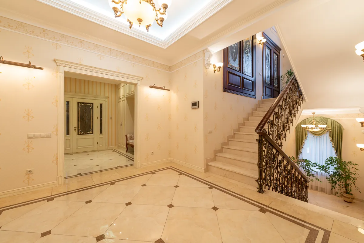
On flooring, Lewis considers porcelain tiling the ‘lazy’ option. It handles sound poorly, and a cracked tile is difficult to replace without disrupting the surrounding surface. He favours linoleum instead, particularly when laid in bold designs such as a checkerboard pattern.
For kitchen spaces, Lewis has no objection to fully fitted cabinetry, but he recommends breaking up the uniformity with a single piece of furniture that ‘injects some character and personality into the space.’ An old French armoire repurposed as a pantry, or an antique breakfast table serving as a kitchen island, are the kinds of moves he suggests. ‘That looks like you’ve given things some real thought,’ he said. ‘It looks creative.’
Beanbags close the list. They ‘just look so messy when they’re not tidied,’ he said, and can be awkward to use. A small tub chair with a high, semi-closed rounded back is, in his view, ‘infinitely nicer.’
Luxurious Magazine has covered the Zoom That Room service, and Oliver Bonas notes Lewis’s expertise spans porcelain, wool, and furniture alongside his design consultancy work. For anyone navigating a renovation or refresh, his sharpest piece of guidance may be the simplest: let light do the heavy lifting, and resist the urge to fill a room with statements that say very little.